Most people who work in B2B SaaS (and many others) regularly use app marketplaces, but don’t stop to consider what’s working in them until they build one themselves.
But we at Partner Fleet think about app marketplaces all day, every day.
So when we find ourselves on a powerhouse like the Zoom App Marketplace, we can’t help ourselves; we have to analyze the good and the bad.
How are Zoom customers able to interact with the app marketplace, find apps they need to connect, or shop for new products that integrate into Zoom?
Hopefully you’ll get some good takeaways for your own app marketplace (or partner directory, partner locator, etc).
Zoom: An open ecosystem
Zoom is a titan in the world of building an open ecosystem. Since we first published this post 18 months ago, they have added nearly 400 apps to their marketplace. And they’ve likely updated, improved upon, and fixed bugs for the 2500 apps they already had.
This growth can’t be achieved by internal teams, even with thousands of developers and product teams working around the clock.
Zoom’s App Marketplace is the public display of an extensively built out open ecosystem business model. Want to learn more about how companies like Zoom have created this exponential growth pattern? Check out this case study and explanation from our co-founder, Cody Sunkel:
Zoom App Marketplace Reviews
We searched far and wide among online reviews and we weren't able to find one bad word about the Zoom App Marketplace.
Here are some of the nice things users had to say:
“Zoom marketplace has an excellent interface with a lot of essential applications available for download to enhance and improve user experience.” —Ankita R.
“With the addition of the App Marketplace, you can really start to take your online meetings and presentations to the next level.” —Helen B.
“The Zoom App Marketplace is vast with support for hundreds of software that you can integrate on Zoom for ease of work.”—Renuka V.
10 things the Zoom App Marketplace got right
Check out the Zoom App Marketplace home page.

Here you can find and connect apps that you use inside of Zoom. There are thousands of integrations. For example, at Partner Fleet we used the Zoom App Marketplace to connect Fathom – a note taking app that records and creates transcripts for meetings and sales calls.
As we navigate through the app marketplace, here are some features and functionality we found very useful.
We’ll start with the marketplace itself: homepage, navigation, and filter options.
1. Highlighted categories introduce you to the marketplace
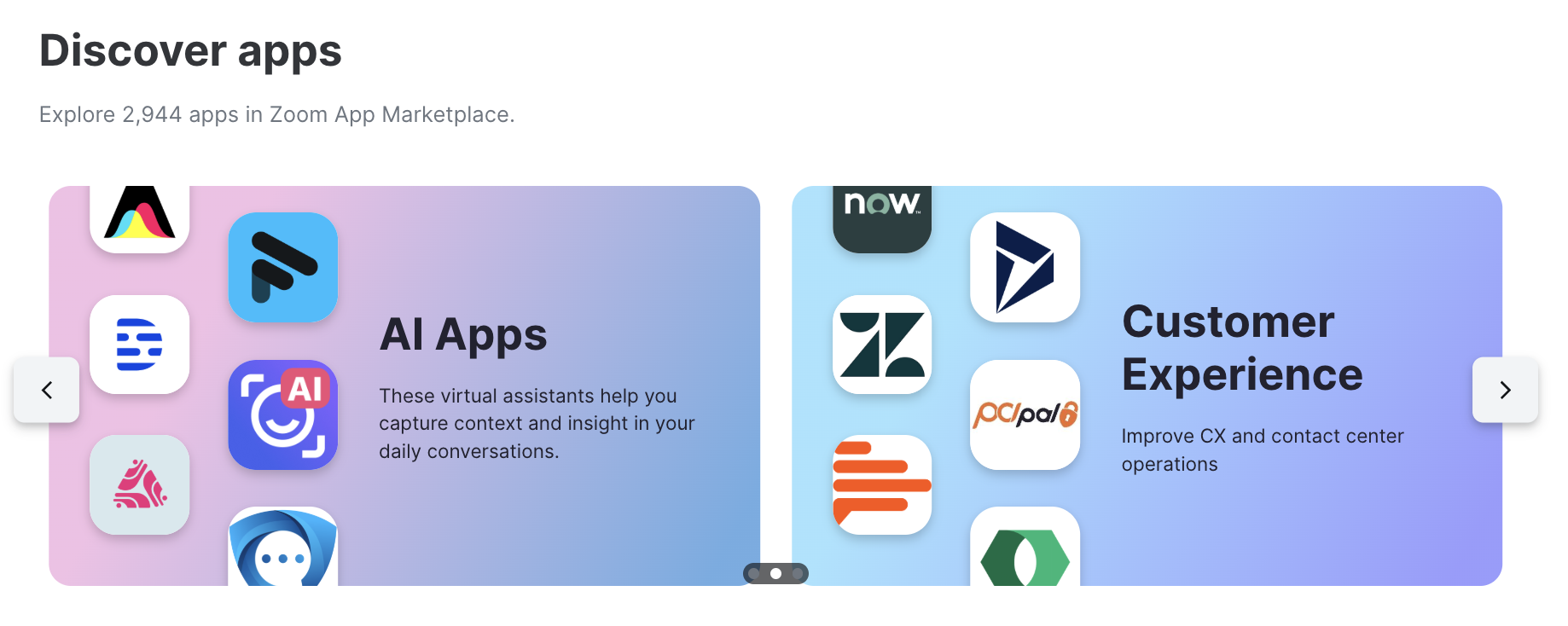
Zoom includes four highlighted categories on the homepage of their marketplace: Conversational AI, Apps built by Zoom, Apps for Zoom Events, and Apps for Team Chat. These are either the most popular categories or ones Zoom wants to make sure you know about.
They’re a good introduction to what you should expect from the marketplace.
Right now, Zoom is highlighting Conversational AI, which is relatively new and hugely popular. Conversational AI tools can offer you a ton of extra insights and value from your calls in a fraction of the time it would take manually.
Seeing this section shows that Zoom is ahead of the curve. Plus, AI could be the deciding factor for a customer looking to install the integration.
2. “Zoom Apps” filters for apps built by Zoom’s internal developers
The category Apps built by Zoom is a highlighted section at the top of their marketplace. It plays a few useful roles.
First, with this highlight, marketplace browsers now know that there are internal Zoom apps. Apps built in house are attractive to customers: They’re generally included at certain plan levels and don’t require a separate account or purchase.
But customers are also made aware of the fact that the other apps in this marketplace aren’t built by Zoom. Most integrations are third party, and could potentially work in different ways.
It’s a good way to promote all apps and also introduce people to the marketplace and set expectations – without much text.
In case you’re interested, here are all the apps built by Zoom:
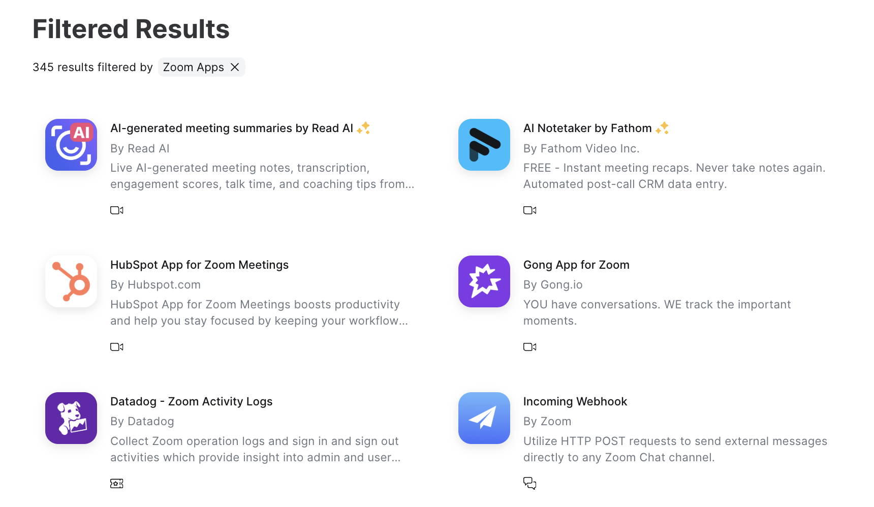
3. Essential apps draw the eye with familiar tools
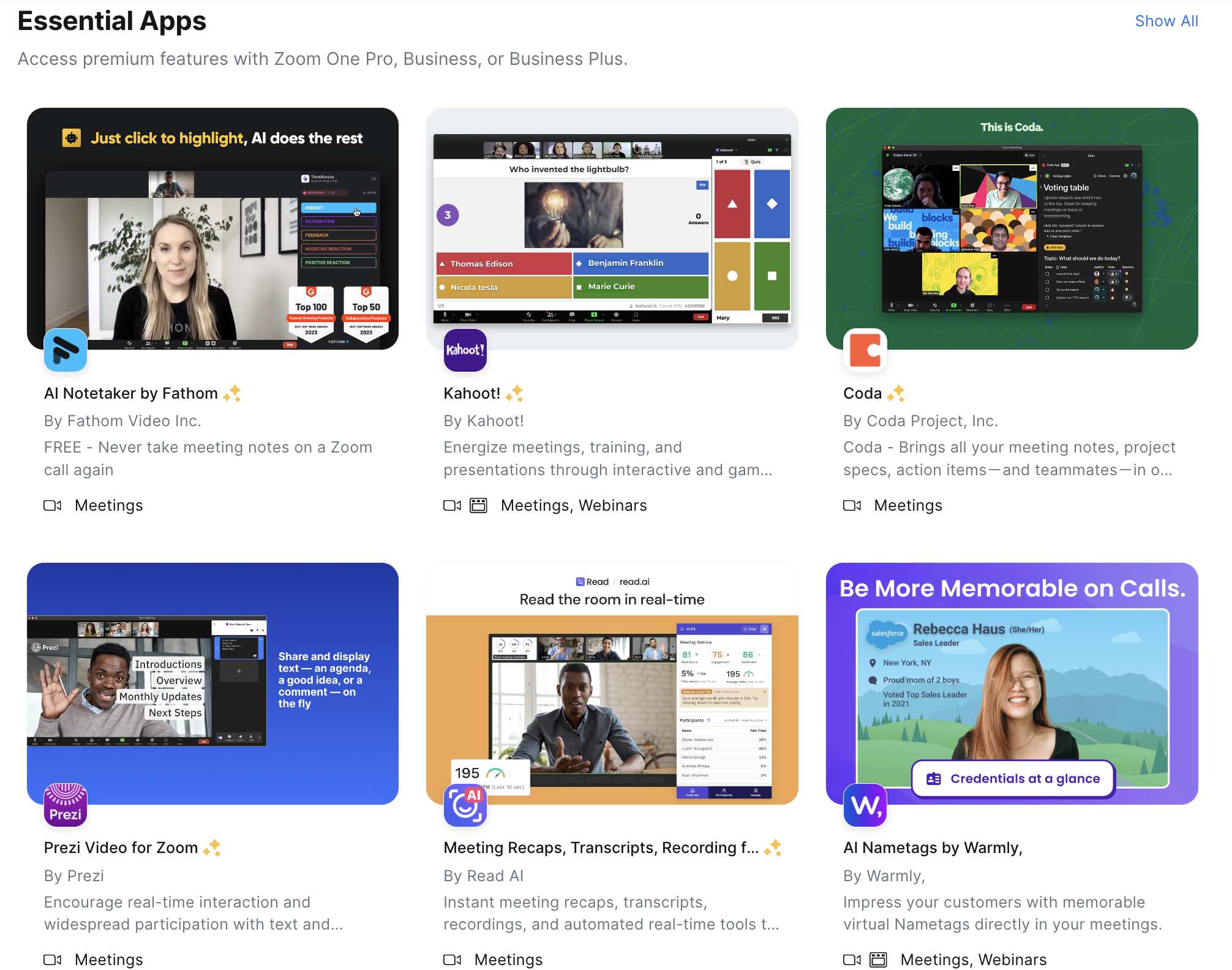
For people browsing the Zoom marketplace, the “Essential Apps” section does a few things.:
- It clearly explains that these are “paid features that are available for free for Pro, Business and Business+ accounts” with a helpful banner.
- It’s packed with familiar products a customer is likely to be using, which allows the most popular integrations to be installed ASAP. (You’ll notice Fathom – the app we use – is front and center.)
- You can get an idea of the kinds of integrations that work best with Zoom. Notetakers, interactive games, collaboration tools, text overlay, virtual nametags… This section gives customers new ideas on how to improve their Zoom experience and promotes partners.
We recommend some kind of highlighted section on every marketplace, whether to show off popular or promoted partners.
4. New apps and App of the Month help users find new stuff
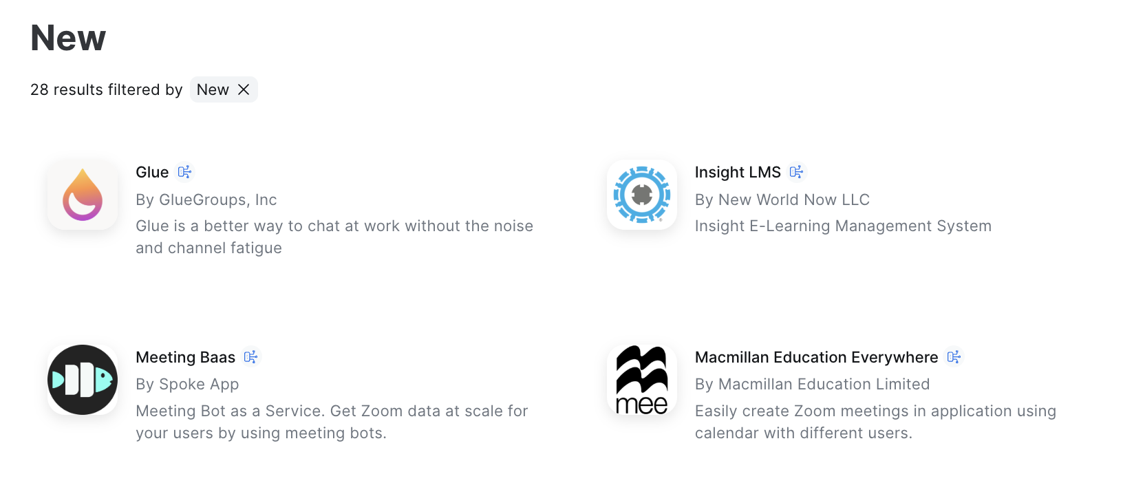
“New or recently updated Apps and Integrations” is the third highlights section on Zoom’s App Marketplace. We think that’s great! (Let’s face it, Zoom has probably tested this page extensively, so they know what they’re doing.)
A “New” section helps Zoom go to market with recently launched apps and integrations and promote integrations working on improvements and enhancements.
Plus, a “New” section lets Zoom marketplace viewers know that they’re focused on integrations – regularly updating and publishing new ones.
They also recently added a “App of the Month” section, which highlights literally one app – just one. This is likely a coveted spot, offered to promote their best tech partners.
5. Categories and filters allow for narrowed search results

If the three homepage highlight sections don’t have what you need, it’s time to start choosing categories and filters to narrow Zooms 1000s of apps to a shortlist of what you need.
People shopping for a solution – rather than searching for a specific integration – can choose a category and then filter down via app types, products, and users to get a smaller list to browse.
When building a marketplace, it’s easy to forget how useful these categories and filters can be to the users browsing them. Not everyone knows what they want – let them narrow down the options so they don’t have to click through pages showing hundreds or thousands of integrations to find their solution. (Hint: they just won’t.)
6. Search drop-downs help you find your app faster
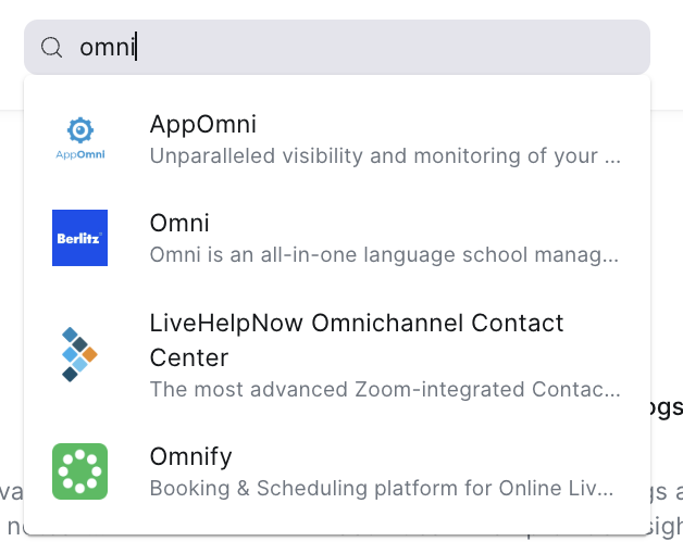
Start the name of your app in the search bar, and a drop-down gives instant suggestions. This helps you find your app faster, without potentially landing on a page you don’t need.
For example, HubSpot has four integrations with Zoom. Instead of having to navigate to four different pages – plus a search results page – you can identify which is the integration you need.
Okay, we’ve covered Zoom’s App Marketplace navigation. Now let’s take a look at their listing pages to see what works there.
7. Screenshots offer engaging above-the-fold value
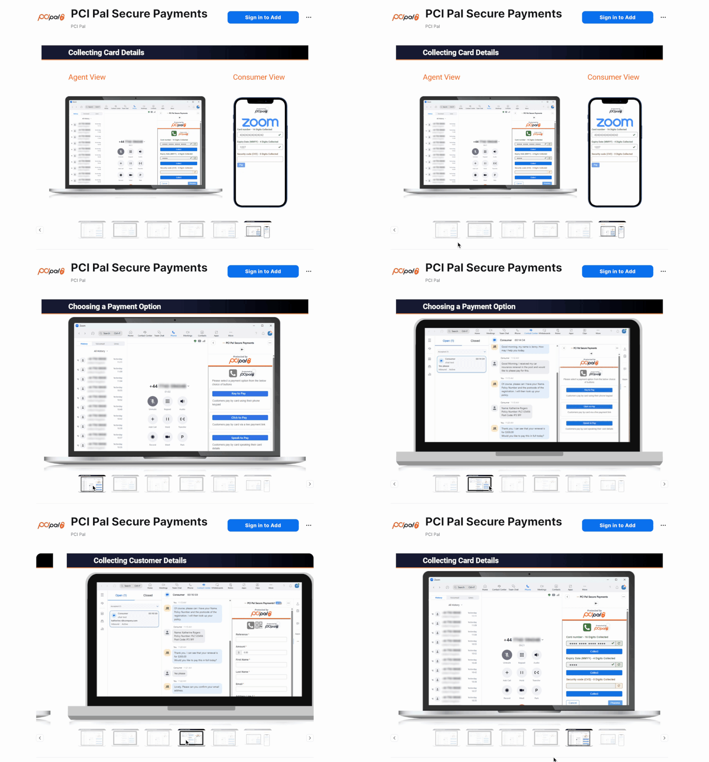
When you get to a listing page, one of the first and most prominent things you see is the media section – offering videos and screenshots that you can easily navigate through.
Most people want to see how an integration works instead of just reading how it works.
Each app has different screenshots in this section, but Fathom does it particularly well. They have slides that show and tell you exactly what to expect from their integration with Zoom.
8. Requirements and Permissions let you know whether you can turn on the integration in your zoom account
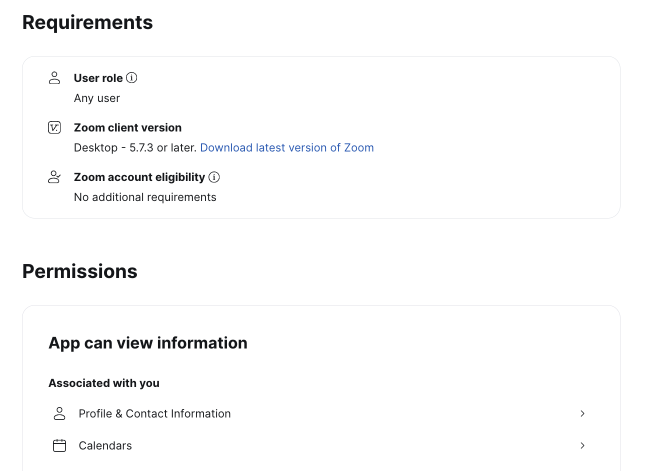
In the “Requirements” and “Permissions” sections, you can learn whether you need to be a Zoom admin or just a user, which version of the app you need, and what data the program has access to. If you’re logged in, this section will include your Zoom account eligibility.
This is the kind of final detail that customers need to make the final step to install. Offering information like this removes friction from installation and drives better integration adoption.
9. Scopes is a great technical section for developers
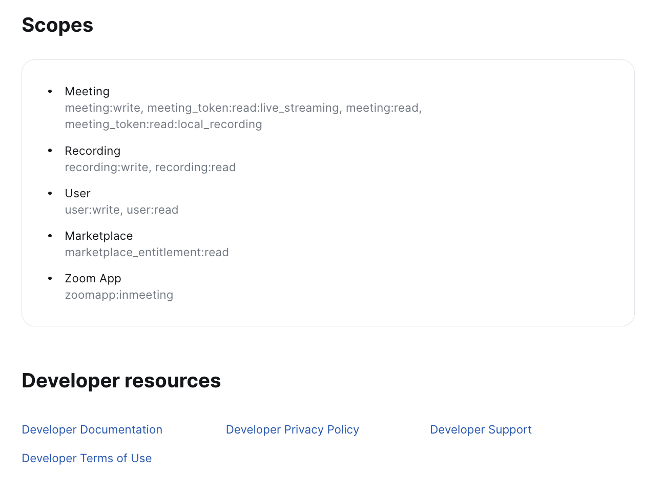
The scopes and developer resources sections of the listing pages are useful for developers, operations teams, and legal, who need to know what’s happening with data in this integration.
We don’t see this in a lot of integration marketplaces, but it must be an oft-requested section since Zoom displays it clearly.
10. CTAs allow for seamless sign in and installation

Once a customer is ready to install the integration, they can do so by easily signing into their account in the browser.
If they’ve already installed it, the integration will show in the marketplace as “Added.”
This is always a smooth process, which is one thing that makes the Zoom App Marketplace renowned for being one of the best out there.
7 recommendations to improve the Zoom App Marketplace
Since we spend our days researching, building, and helping our customers improve their marketplaces, we couldn’t help ourselves – we found a few things we think Zoom could improve.
We highlight these, not to disparage Zoom, but rather as an example for others to see if they can find places to improve their own marketplace.
1. Zoom’s categories aren’t that useful
We think most customers would head toward search rather than clicking on, say, “collaboration.” There are 375 “collaboration” apps – you’re not likely to scroll through all of them.
A category for the sake of a category doesn’t make sense. It needs a problem to be solved. So to improve, Zoom could offer categories based on customer value or outcome.
2. The apps themselves can be mis-categorized
Fathom, for example, is categorized as a collaboration tool, although they clearly describe themselves as a note taking tool – which is its own category.
They could solve this issue by doing a regular review of apps and their categories for accuracy and usefulness (or prompting integration partners to review their own listings).
3. Searches only show results with the keyword in the app or integration title
With bad categories, users are likely to run to search. But it’s not great unless you have the integration’s name you’re searching for.
For example, a search for “notetaker” will return AI Notetaker by Fathom, but “note taker” returns “Pattern AI note taker.” Neither shows the 52 results categorized under “Note Taking.”
Since many people who reach the marketplace may search first, Zoom could benefit from expanding their search to include results under filters, categories, and with keywords in their listing.
4. Zoom’s “New” section is vague
New this month? This week? This year? A new section without any parameters reduces the value and legitimacy of Zoom’s claim that they’re regularly publishing updated integrations.
Although, since it’s Zoom, we still believe them.
5. After using filters, it’s unintuitive to navigate back to the useful homepage
Selecting filters then removing them is an interesting experience. Instead of being brought back to the homepage we raved about in this post, you land on a “Search for apps” page, with all 2,559 apps listed. These are presumably organized by popularity, but it’s hard to tell.
Send us back to the homepage, Zoom!
6. On listing pages, there’s no option to click back to a category page
A customer searching through apps for the right solution may want to navigate back to one of that solution’s categories. But there’s no way to do that in Zoom. You have to start over on their apps page or homepage and navigate back to the category you’re looking for.
Zoom could create breadcrumbs or clickable tags to allow for better navigation.
7. Users can’t request a new app or integration
On Partner Fleet marketplaces, if you search for an app that isn’t there, you’re given the option to request it. There’s no request option on the Zoom App Marketplace, which is a missed opportunity.
By adding a “request an integration” option on searches with no results, they could gather valuable information about what customers want. That could help them seek out new integration partners and prioritize their own roadmap.
Conclusion: Well done Zoom
All-in-all, Zoom is among the top in marketplace UX, usefulness, and ease-of-installation. If you’re looking to make improvements to your marketplace or just get some inspiration, we recommend navigating through their options and listings.
Looking for more help or an out-of-the-box marketplace to drive integration adoption? Book a demo of Partner Fleet.


